

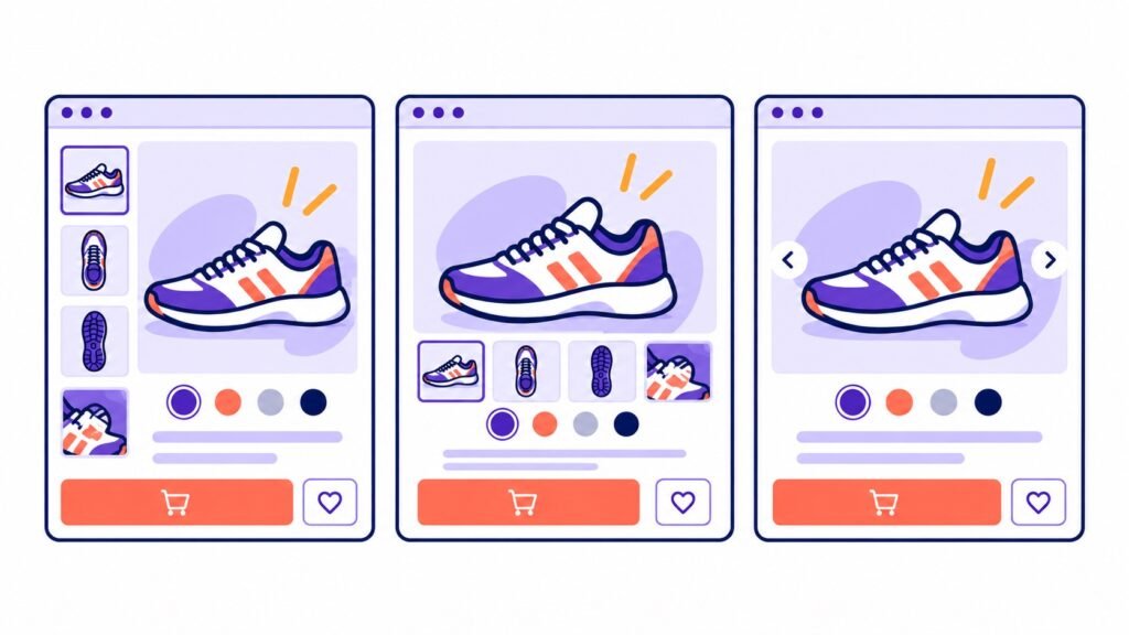
A product gallery should make it simple for shoppers to find the next image, inspect details and return to the purchase decision. The best layout depends on the product media, theme and device rather than a single default.
Start with the product imagery
Consider how many images each product needs and whether they are mostly landscape, portrait or square. A small, consistent collection often suits a simple thumbnail strip; a larger range may need more visible thumbnails or clearer navigation.
Compare thumbnail positions
- Left or right thumbnails can work well beside a wide main image.
- Bottom thumbnails keep the gallery compact and familiar on many product pages.
- Choose a position that does not compete with the product title, price and purchase controls.
Make navigation obvious
Use arrows or dots where they make additional media clear. If thumbnails already give a strong overview, too many controls can make the gallery harder to scan.
Review the mobile layout
Check the gallery on a narrow screen. Ensure thumbnails, pagination and expanded views remain easy to use without hiding product detail.
Gallery Spotlight provides layout, thumbnail and navigation controls for WooCommerce product galleries.